All Projects
Branding
A — Socks Brand Identity
Overview
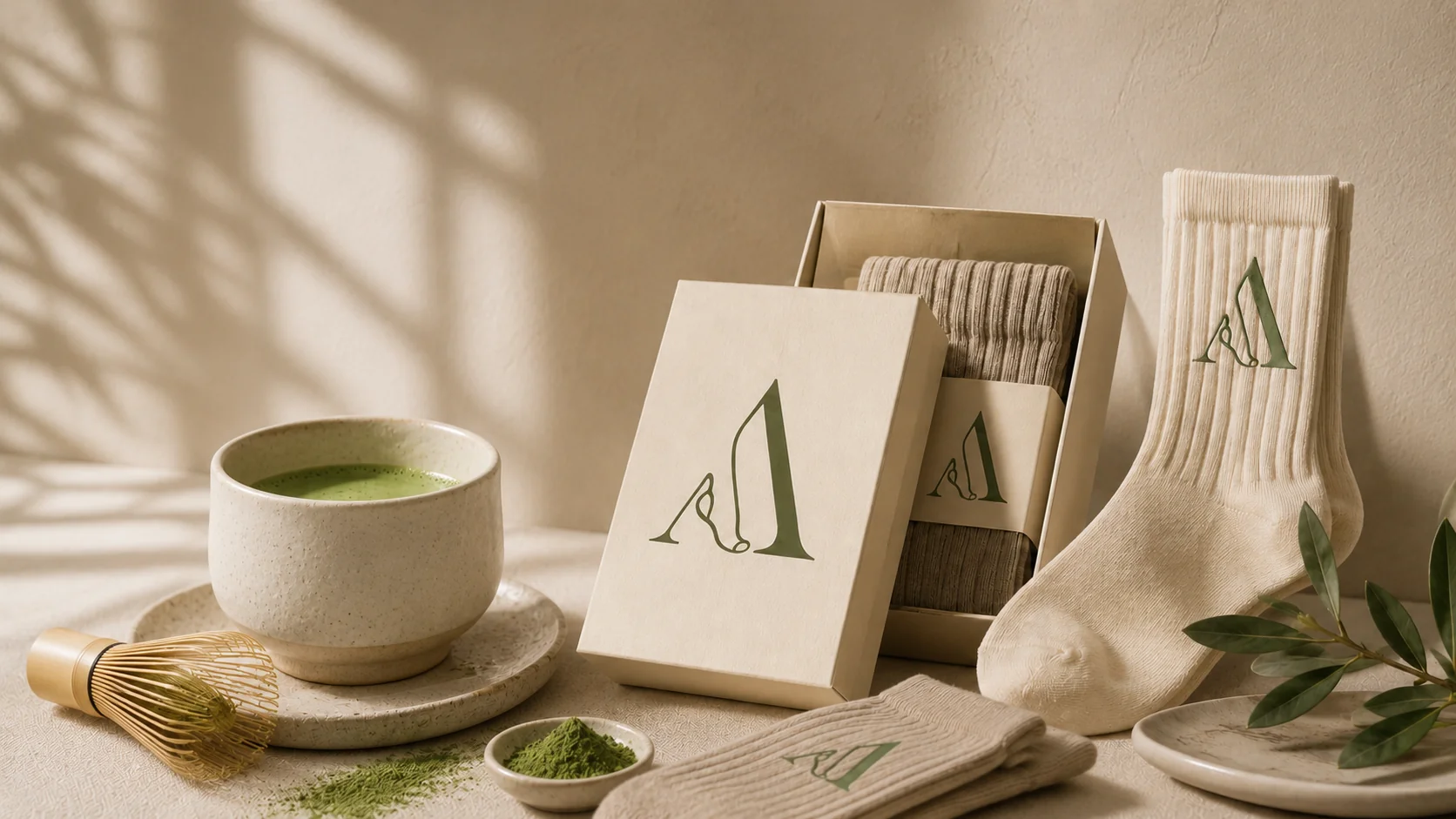
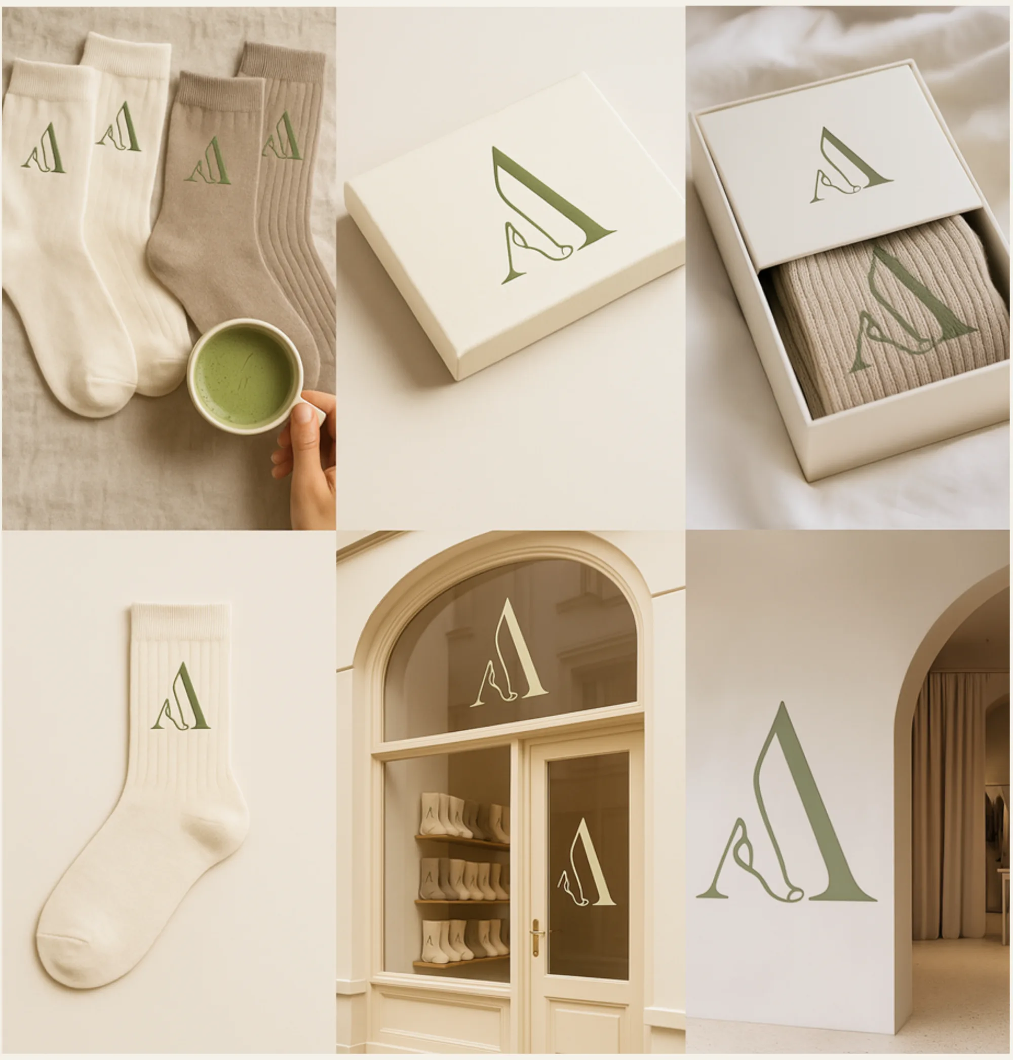
Repositioned a UK socks brand with a concept-driven identity designed to spark curiosity rather than explain everything upfront. Created a logo built around a simplified "A" that transforms into a sock shape, functioning as both the main logo and a flexible icon system. Introduced a matcha-inspired green to reference softness, tactility, and contemporary wellness cues. Developed a brand identity system and guidelines designed to work across both B2B and B2C contexts, balancing commercial clarity with cultural intrigue.
Impact
Full
Logo & Identity System
B2B+B2C
Brand Guidelines
Flexible
Icon System
The Work
Like what you see?
Let's build something like this.
Next Project
Branding